
Optimize Logo for Mobile View
Typically, the same logo will display on both the website and mobile versions of your website; however, Mobile Design Editor allows for optimization of the mobile display. The logo width can be changed to improve the mobile display, or if there is a different logo version that would be better fit for the website vs the mobile view, they can be optimized. Assuming that the web version was used for the design implementation, this article reviews how to change that logo for the mobile display.
 |
Tip: Mobile Design Editor, and the ability to edit the logo specifically on the mobile display, is only available on current layouts. |
Change Logo Width for Mobile Display
- Go to Design > Design Editor.
- Click Mobile and Tablet next to the Published design.
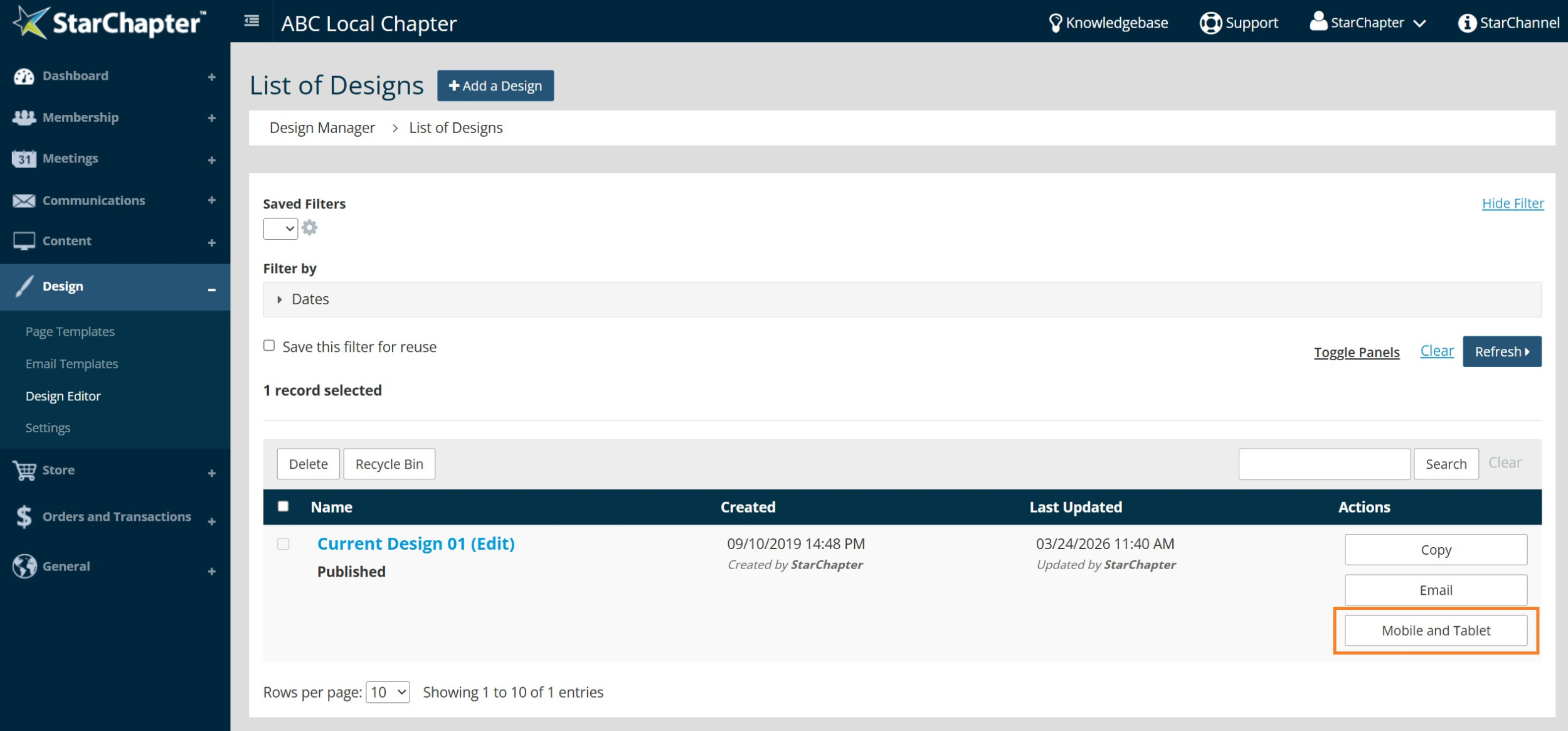
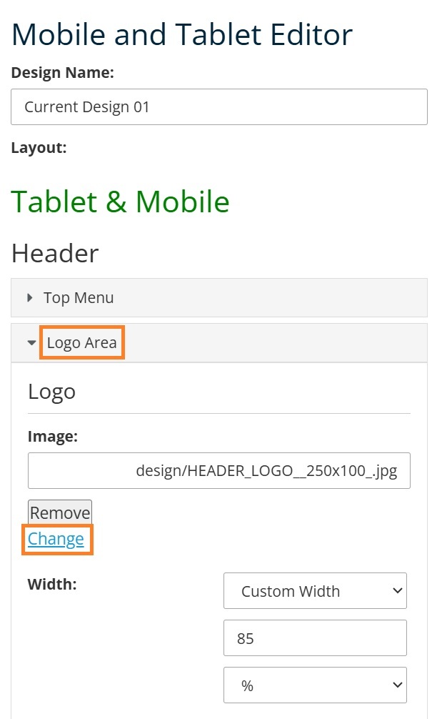
- Expand the Logo Area.
- Update the "Width" field to reduce the logo size. The best width will vary between different logo images, so you may need to try a few widths to determine your preference.

Tip: To optimize the logo on only mobile, rather than tablet and mobile, scroll to the bottom of the Mobile Design Editor. Edit Mobile Only > Logo Area > Width. That setting will only effect the logo on the smallest mobile screens.
- Click Save at the bottom of the Mobile Design Editor.
Change Logo for Mobile Display
- Go to Design > Design Editor.
- Click Mobile and Tablet next to the Published design.
- Expand the Logo Area.
- Click Change under the Logo field.
- Select the new logo from the Moxie Manager or drag/drop the file into Moxie and then select it.
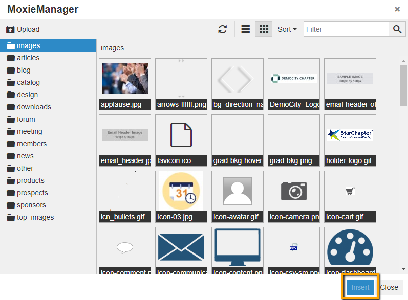
- Click Insert.
- Click Save at the bottom of the Mobile Design Editor.

