
Change Hamburger Menu Style
The hamburger menu is the compressed version of your main navigation used on mobile displays. This format allows users to access the menu as needed without having it take up a large part of their screen. The hamburger menu was styled when the design was implemented, but various options are available, if change is desired.
 |
Tip: Mobile Design Editor, and the ability to edit the hamburger menu, is only available on current layouts. |
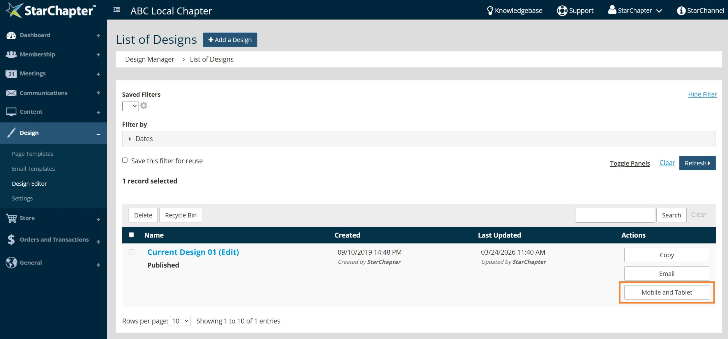
- Go to Design > Design Editor.
- Click Mobile and Tablet next to the Published design.
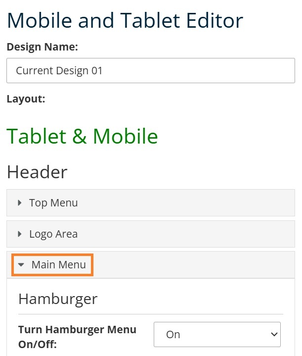
- Expand the Main Menu section.
- Locate the Menu Button section.
- Edit the "Background: Color" field to change the color of the square. Enter #ffffff for a white background.
- Edit the "Border" field to add, change, or remove a border from the square. Set the Width to "0" for no border.
- Edit the "Menu Lines: Color" field to change the color of the 3 lines in the middle of the square.
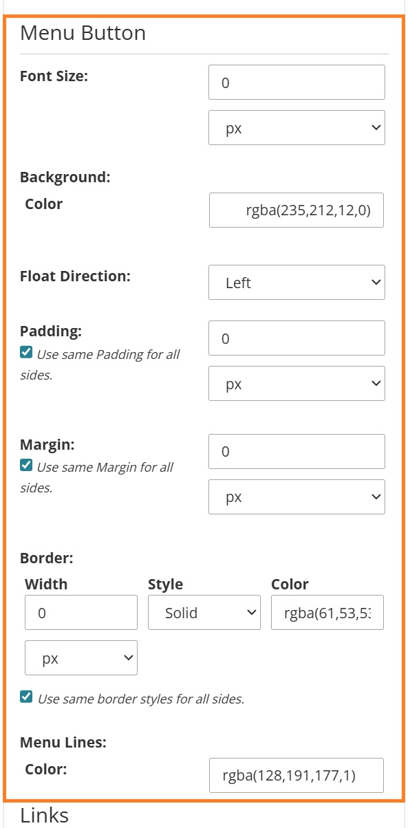
- Click Save to apply the change.

