
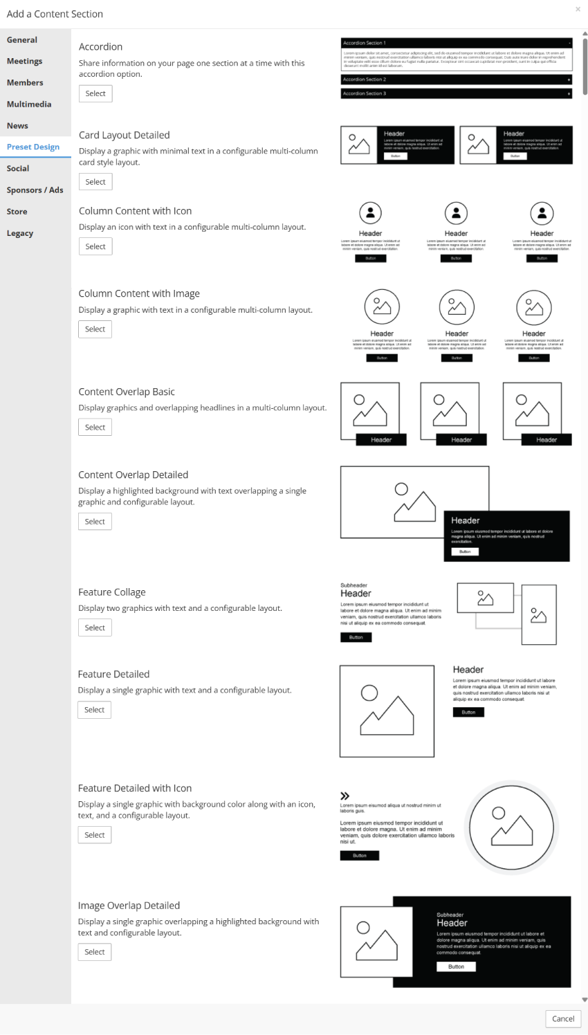
Preset Design Content Section Library
StarChapter’s Preset Designs are ready-made content sections that help you quickly create polished, engaging pages on your site. These content sections streamline content creation for administrators while ensuring a consistent and professional look across your site.
All of these Preset Designs are engineered to look best when placed in a 100% container. Each content section is preconfigured with the most commonly used settings, however you can adjust these settings as needed.
Select a content section in the screenshot on the right to learn more about that specific content section.
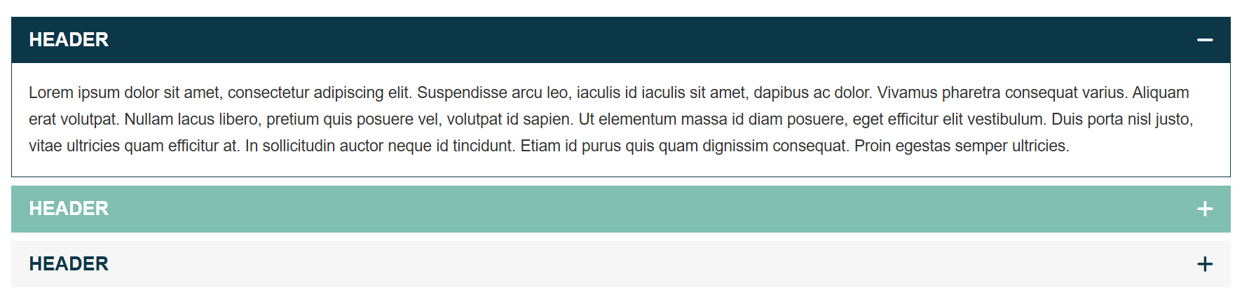
Accordion
- Break up content into expandable sections, encouraging visitors to interact with your content.
- Add as many accordion sections as you need with the option to reorder them using the drag and drop functionality.
- A great option for FAQs or lengthy content that needs to be condensed to reduce page length.
 |
Tip: Optional Settings allow you to customize accordion section colors, icons, and behavior. For more information on Optional Settings, click here. |
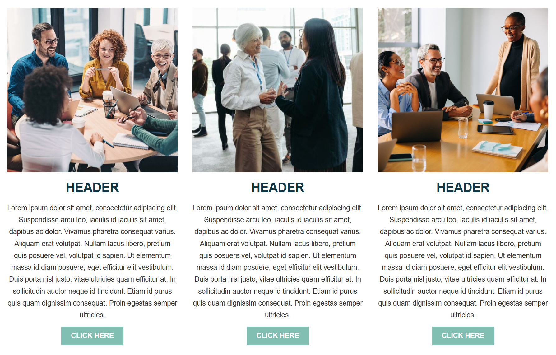
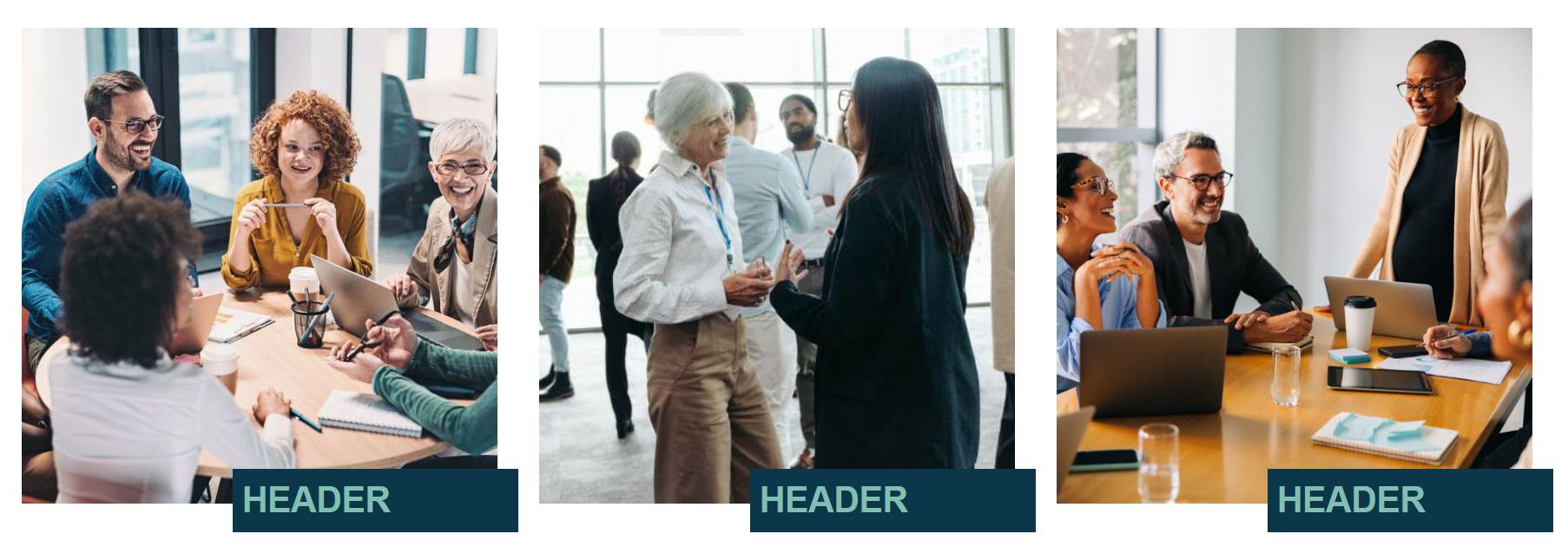
Card Layout Detailed
- Display an image with minimal text and an optional button or link in a card-style layout.
- Add as many cards as you like, with control over how many display in a row through the number of columns selected.
- If no link or button is desired, leave the "Display Text" and "Link" empty.
- A great option for introductory content that can link out to a separate page.
|
Tip: Optional Settings allow you to customize images and text positioning, background color options, and button/link type . For more information on Optional Settings, click here. |
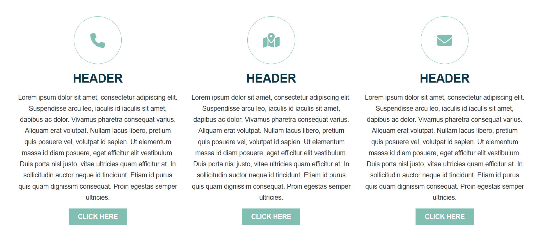
Column Content with Icon
- Display an icon with short or long text in a configurable multi-column layout.
- Add as many sections as you like, with control over how many display in a row through the number of columns selected.
- Select 1 icon per section, choosing from thousands of icon options.
- If no link or button is desired, leave the "Display Text" and "Link" empty.
- Ideal for introductory content that can link out to a separate page, or as a way to display body content in a more digestible format.
|
Tip: Optional Settings allow you to customize icon size and alignment, as well as content alignment and button/link type. For more information on Optional Settings, click here. |
Column Content with Image
- Display an image with text in a configurable multi-column layout.
- Add as many sections as you like, with control over how many display in a row through the number of columns selected.
- If no link or button is desired, leave the "Display Text" and "Link" empty.
- Ideal for introductory content that can link out to a separate page, or as a way to display body content in a more digestible format.
|
Tip: Optional Settings allow you to customize image size and shape, button/link type, and content alignment . For more information on Optional Settings, click here. |
Content Overlap Basic
- Display images with overlapping headlines in a multi-column layout. No body text in this option.
- Add as many sections as you like, with control over how many display in a row through the number of columns selected.
- Best used for highlighting images with key words or tag lines.
|
Tip: Optional Settings allow you to customize content alignment, background color, and layout of images and text . For more information on Optional Settings, click here. |
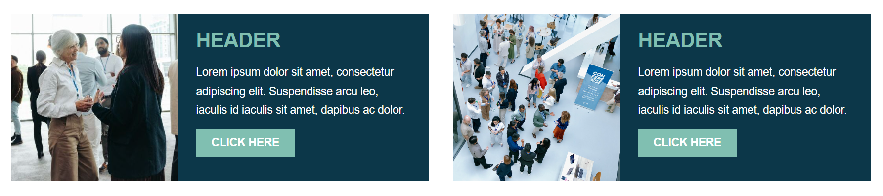
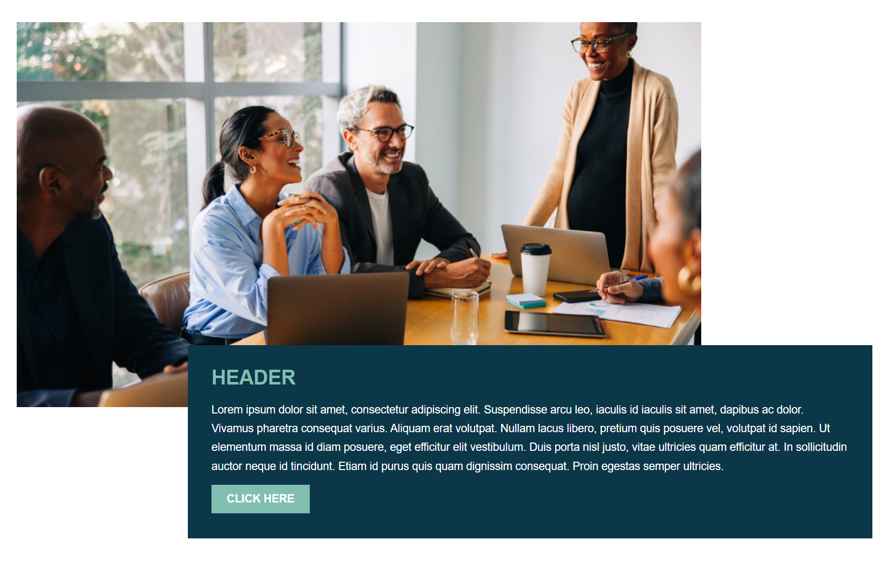
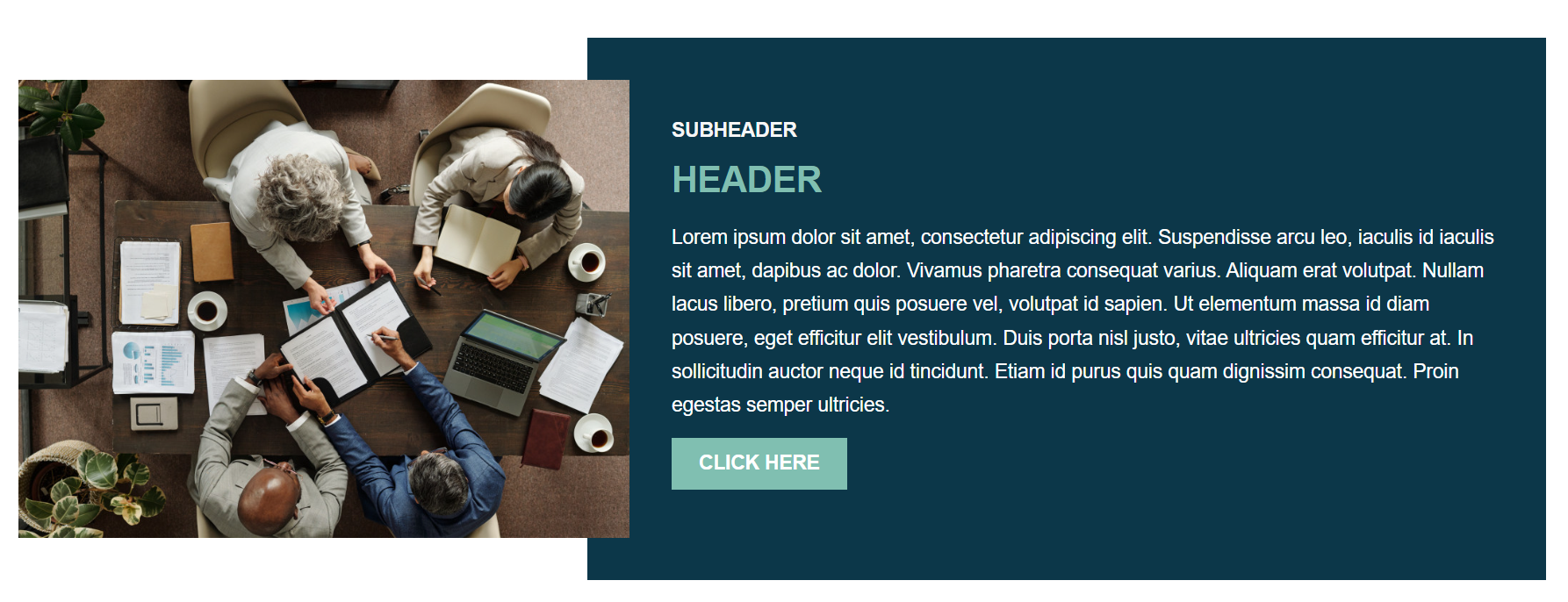
Content Overlap Detailed
- Display a single large image behind a highlighted background with text and a configurable layout.
- "Image Focal Point" determines the main point of focus within your image. This ensures the most important part remains visible when the image is cropped to fit the preset shape.
- If no link or button is desired, leave the "Display Text" and "Link" empty.
- Ideal for highlighting a single image or flyer with short or long text.
|
Tip: Optional Settings allow you to customize the layout of images and text, and background color. For more information on Optional Settings, click here. |
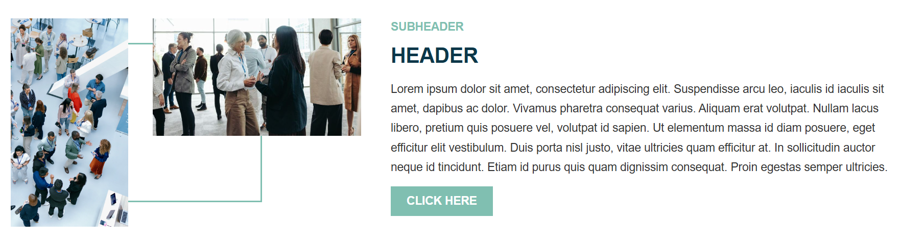
Feature Collage
- Display two graphics with text, geometric design, and a configurable layout.
- "Image Focal Point" determines the main point of focus within your image. This ensures the most important part remains visible when the image is cropped to fit the preset shape.
- If no link or button is desired, leave the "Display Text" and "Link" empty.
- Ideal way to display content in a unique, engaging design.
|
Tip: Optional Settings allow you to customize the layout of images and text, and text alignment . For more information on Optional Settings, click here. |
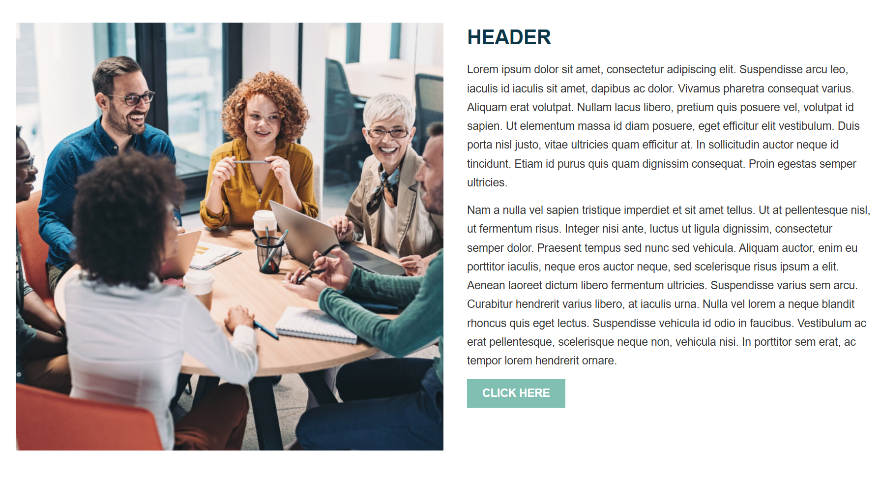
Feature Detailed
- Display a single large image with text and a configurable layout.
- "Image Focal Point" determines the main point of focus within your image. This ensures the most important part remains visible when the image is cropped to fit the preset shape.
- If no link or button is desired, leave the "Display Text" and "Link" empty.
- Great for highlighting a single image or flyer with long text.
|
Tip: Optional Settings allow you to customize image shape, and layout of images and text. For more information on Optional Settings, click here. |
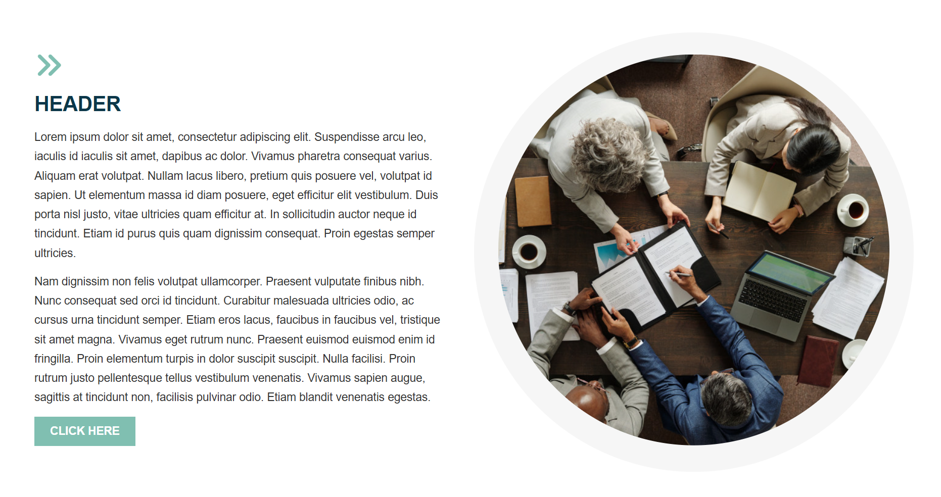
Feature Detailed with Icon
- Display a single graphic bordered with a background color, along with an icon, text, and a configurable layout.
- Select 1 icon to accent your content, choosing from thousands of icon options.
- "Image Focal Point" determines the main point of focus within your image. This ensures the most important part remains visible when the image is cropped to fit the preset shape.
- If no link or button is desired, leave the "Display Text" and "Link" empty.
- Ideal way to display content in a unique, engaging design.
|
Tip: Optional Settings allow you to customize image shape, and the layout of images and text. For more information on Optional Settings, click here. |
Image Overlap Detailed
- Display a single graphic overlapping a highlighted background with text and configurable layout.
- "Image Focal Point" determines the main point of focus within your image. This ensures the most important part remains visible when the image is cropped to fit the preset shape.
- If no link or button is desired, leave the "Display Text" and "Link" empty.
- Ideal way to display content in a unique, engaging design.
|
Tip: Optional Settings allow you to customize the layout of images and text, and background color. For more information on Optional Settings, click here. |
Optional Settings defined
The following optional settings are found throughout the Preset Design Content Sections.
Align Buttons: If unchecked, buttons will display right after text ends in the container. This means they may stagger due to differing length of text. If checked, the buttons will all align at the bottom of the containers for a more unified look.
Button / Link Type: Select the option to display a primary button, secondary button, or a link. These styles are already preset in Design Editor to match your site.
Column Alignment: If there are less sections added then the "Max Number of Columns to Display Per Row", select how the columns within that row should align.
Color Option: Select between 2 color options; options are set in the Design Editor and are preset to match your site.
Full Width Button: If checked, the button will display at full container width instead of width of button text.
Horizontal Text Alignment: Align your text to the right, left, or center of the text container.
Icon Alignment: Align your icon to the right, left, or center of the text container.
Icon Size: Control the percentage of the container the icon fills by increasing or decreasing the 1-100% number.
Image Shape: Select from circle, square, rounded corners, horizontal rectangle, vertical rectangle.
Image Size: Control the percentage of the container the image fills by increasing or decreasing the 1-100% number.
Max Number of Columns to Display Per Row: How many sections will display in a row.
Section Layout: Select if you would like the images displayed in the left or right container. Text will display in the opposite container.
Vertical Text Alignment: Align your text to the top, center, or bottom of the text container.